
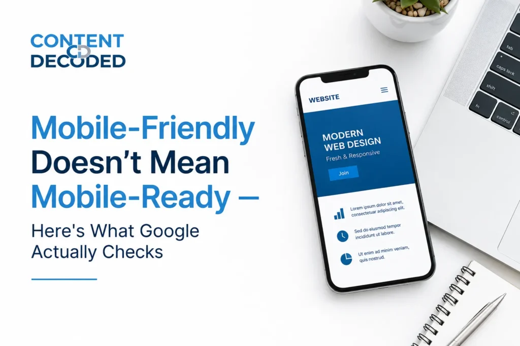
Mobile-Friendly Doesn’t Mean Mobile-Ready — Here’s What Google Actually Checks
A mobile-friendly website passes Google’s technical checks. A mobile-ready website is what Google actually ranks and passing those technical checks does not automatically make your website ready for mobile.
Most website owners still misunderstand this. They think mobile-first indexing is only about technical SEO, so they focus on:
- Responsive design
- Mobile speed
- Core Web Vitals
- Button sizes
- Mobile usability tests
All of those things matter, but Google is also checking something much bigger now: how readable, usable, and comfortable your content feels on mobile devices.
Almost 64% of readers of Google traffic are mobile users, so how well they read and stay on websites matters more.
A website can technically pass every mobile test and still provide a poor mobile reading experience. Long text blocks, broken tables, difficult navigation, intrusive ads, and bad content structure can still hurt engagement and rankings.
That is the real problem many websites face today. They optimise the technical side of mobile-first indexing while completely ignoring the actual mobile content experience.
People Only Check Technical Things When It Comes to Mobile-First Indexing

Most companies still treat mobile-first indexing like a technical checklist. Once the website becomes responsive and the mobile PageSpeed score improves, they assume the job is finished.
But Google now looks far beyond technical compatibility. It also checks how users actually experience your content on mobile devices.
The problem is that most teams only focus on technical optimisation while completely ignoring mobile readability and usability.
Here are the things people usually focus on.
Responsive Design
Most developers first check whether the layout properly adjusts to different screen sizes. If the website fits correctly on phones and tablets, they consider it mobile-optimised.
But responsive design only fixes the layout, not the reading experience.
A website can still feel frustrating on mobile because:
- Paragraphs look too long
- Content feels crowded
- Important information gets pushed down
- Tables break on smaller screens
- Images take too much space
So even though the site technically works on mobile, users may still struggle to comfortably read the content.
Core Web Vitals
SEO teams spend a lot of time improving Core Web Vitals because Google uses them to measure mobile experience.
| Metric | What It Measures |
| LCP | Loading speed |
| INP | Interaction speed |
| CLS | Layout stability |
These metrics matter, but many websites become too focused on scores instead of real usability.
A site may pass performance tests while still creating a poor mobile experience because of:
- Large text blocks
- Sticky ads
- Confusing navigation
- Broken tables
- Slow interaction
Google increasingly looks at the full mobile experience, not just speed numbers.
In 2026, INP has replaced the old speed metrics as the king of responsiveness.
- What people check: Does the page load fast?
- What they ignore: Does the page react fast when I touch it?
Mobile Speed Optimization
Developers optimise:
- Images
- Scripts
- Fonts
- CSS files
- Caching
All of this helps improve loading speed.
But many websites make another mistake while trying to improve mobile performance. They start removing or hiding important content just to make the page lighter.
For example:
- Important sections get collapsed
- Internal links disappear
- Content gets hidden behind “Read More”
- Useful information loads too late
This may improve speed scores, but it weakens the actual mobile content experience.
Page Speed and Core Web Vitals are different things because core web vitals are what people experience in real time, and page speed is just a score based on real-time testing.
Touch-Friendly Buttons
Most mobile testing tools only check whether buttons are large enough to tap.
But mobile usability is not only about button size.
People use phones differently than desktops. Mobile users scroll quickly, use one hand, and expect fast interaction.
Many websites still feel awkward on mobile because:
- Buttons are hard to reach; the popular one is back button hijacking
- Menus need too many taps
- Popups interrupt reading
- Forms feel annoying to complete
Small usability issues feel much bigger on smaller screens.
Responsive Images
Large desktop-style images often hurt the mobile experience.
On mobile, oversized visuals can:
- Slow down pages
- Push useful content too far down
- Interrupt reading flow
- Fill most of the screen
Mobile users usually want quick answers. If they need to scroll through large images before reaching useful information, many leave early.
Mobile Navigation
Most websites use hamburger menus to save space on mobile devices.
But many mobile menus become difficult because they contain:
- Too many dropdowns
- Hidden categories
- Small tap areas
- Confusing layouts
Desktop users can explore complicated navigation more easily, but mobile users expect simple and fast access to information.
If navigation feels slow or frustrating, people leave quickly.
What Google Actually Wants: Mobile-First Content Readability
This is the part most website owners still ignore.
Google’s mobile-first indexing is no longer only about whether a website technically works on mobile devices. Google also looks at how easy your content is to read, scroll, and consume on smaller screens.
A website can load fast and still provide a poor mobile experience if the content feels difficult to read or navigate.
That is why readability now plays a major role in modern SEO.
Below are the content-related things Google increasingly cares about.
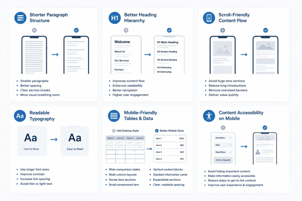
Shorter Paragraph Structure
Paragraphs behave very differently on mobile screens.
A paragraph that looks normal on desktop can turn into a huge wall of text on a phone, making the page feel heavy and difficult to read.
Mobile users scroll quickly and scan content before deciding whether to continue reading.
That is why mobile-friendly content usually uses:
- Smaller paragraphs
- Better spacing
- Clear section breaks
- More visual breathing room
The goal is not to make every sentence short. The goal is to make the content feel comfortable while scrolling on mobile. That’s why long content is now not necessary to rank if it delivers only quanity not quality.
Better Heading Hierarchy
Headings help both users and Google understand page structure.
On mobile devices, users often scan headings first before reading the actual content. Clear headings help people quickly find the information they want.
Good heading structure improves:
- Content flow
- Readability
- Navigation
- User engagement
Many websites still use oversized or decorative headings designed mainly for desktop appearance, but on mobile they create unnecessary scrolling and break the reading flow.
Scroll-Friendly Content Flow
Mobile reading is naturally vertical.
Users continuously scroll while looking for useful information, so the content should flow smoothly without interruptions.
Common problems that hurt mobile reading include:
- Huge hero sections
- Long introductions
- Oversized banners
- Large empty spaces
- Too many distractions
The best mobile pages deliver important information quickly instead of forcing users to scroll too much before reaching value.
Readable Typography
Typography plays a huge role in mobile readability.
Many websites use fonts that look clean on desktops but become uncomfortable to read on phones.
Common mistakes include:
- Small font sizes
- Thin text
- Low-contrast colors
- Tight spacing
- Light gray text on white backgrounds
Good mobile typography should feel effortless. Users should never need to zoom in just to comfortably read content.
Mobile-Friendly Tables and Data Presentation
Tables are one of the biggest mobile usability problems.
Most desktop tables become difficult to use on smaller screens because they force users to zoom or scroll sideways.
Common mobile table problems include:
- Cut-off columns
- Tiny text
- Horizontal scrolling
- Hidden information
- Broken layouts
That is why many websites now replace traditional tables with simpler mobile-friendly layouts.
| Old Desktop Style | Better Mobile Style |
| Wide comparison tables | Vertical content blocks |
| Multi-column layouts | Stacked information cards |
| Dense data sections | Expandable sections |
| Small compressed text | Clear, readable spacing |
The goal is to make information easy to consume on smaller screens.
Content Accessibility on Mobile
Many websites accidentally make important content harder to access on mobile.
This usually happens through:
- Tabs
- Accordions
- “Read More” buttons
- Hidden expandable sections
- Heavy interactive layouts
Google can understand hidden content better today, but poor implementation still creates problems for users.
If users struggle to quickly access important information, engagement drops. And when users leave the page quickly, Google notices those signals.
The Real Problem: Teams Still Build for Desktop First
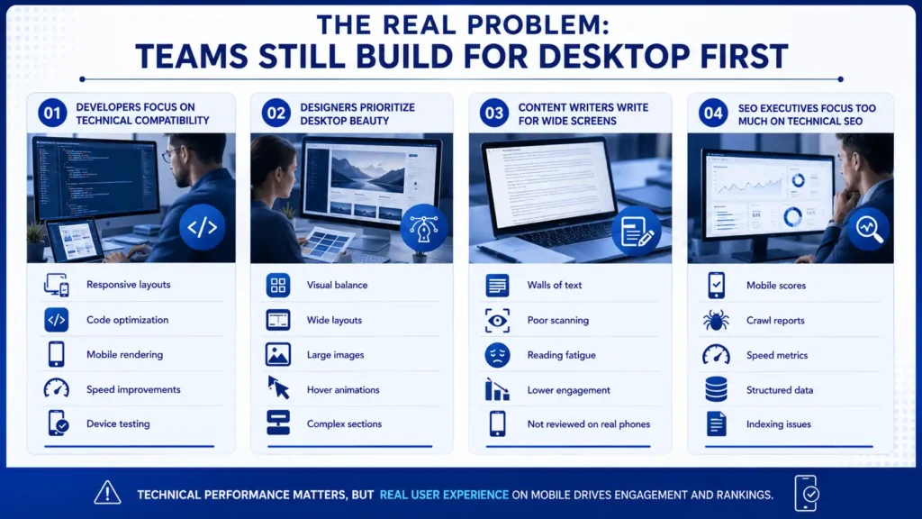
The biggest issue is not technology.
The real issue is mindset.
Most teams still work mainly from desktop environments, so they naturally optimise websites for desktop comfort first.
Mobile becomes secondary.
That creates a huge disconnect between how websites are built and how users actually consume content today.
Web Developers Focus on Technical Compatibility
Developers usually prioritise technical performance because that is their main responsibility.
They focus on:
- Responsive layouts
- Code optimization
- Mobile rendering
- Speed improvements
- Device testing
All of this matters.
But technical performance alone does not guarantee a good mobile reading experience.
A technically perfect website can still feel mentally exhausting if the content structure is poor.
Web Designers Prioritize Desktop Beauty
Most designers create websites on large screens.
That naturally pushes them toward desktop-focused thinking.
Designers often prioritize:
- Visual balance
- Wide layouts
- Large images
- Hover animations
- Complex sections
These elements may look impressive on desktops but create friction on smaller screens.
Mobile users care more about:
- Clarity
- Simplicity
- Speed
- Easy scrolling
- Fast access to information
Beautiful design is helpful, but usability matters more on mobile.
Content Writers Write for Wide Screens
Content writers usually create articles on laptops or desktop monitors.
Because of this, paragraphs often appear shorter and cleaner during writing.
But once published on mobile, the structure changes completely.
Paragraphs become longer visually, which makes reading feel heavier.
This creates problems like:
- Walls of text
- Poor scanning
- Reading fatigue
- Lower engagement
Many writers never review their articles properly on actual phones before publishing.
That is a major mistake in mobile-first publishing.
SEO Executives Focus Too Much on Technical SEO
Many SEO professionals still treat mobile-first indexing mainly as a technical process.
They monitor:
- Mobile scores
- Crawl reports
- Speed metrics
- Structured data
- Indexing issues
Those things matter, but Google increasingly evaluates real user experience on mobile.
If users struggle to comfortably consume the content, technical scores alone will not save rankings.
What Google Actually Sees in Your Website
Google no longer mainly evaluates your desktop version.
Its primary understanding of your website now comes from the mobile version.
That means Google mostly checks
- Mobile content
- Mobile structure
- Mobile links
- Mobile usability
- Mobile loading behavior
- Mobile interaction quality
If important content exists only on desktop or becomes weak on mobile, Google may not value it properly.
This is why many websites lose rankings even though their desktop version looks excellent.
The mobile version now carries the real SEO weight.
Mobile-Friendly vs. Mobile-Readable
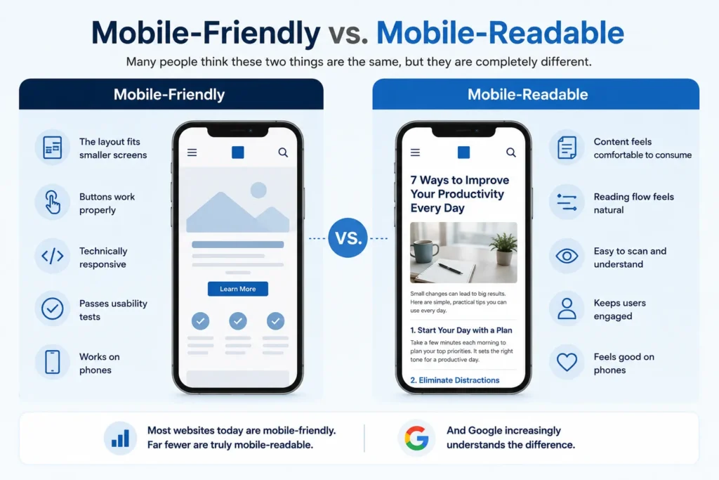
Many people think these two things are the same, but they are completely different.
| Mobile-Friendly | Mobile-Readable |
| The layout fits smaller screens | Content feels comfortable to consume |
| Buttons work properly | Reading flow feels natural |
| Technically responsive | Easy to scan and understand |
| Passes usability tests | Keeps users engaged |
| Works on phones | Feels good on phones |
Most websites today are mobile-friendly. Far fewer are truly mobile-readable.
And Google increasingly understands the difference.
Common Mobile Problems That Hurt Your Rankings
Many websites unknowingly create mobile usability problems that directly hurt engagement and rankings.
Walls of Text
Large text blocks overwhelm mobile readers quickly. Users prefer content that feels easy to scan while scrolling.
Broken Tables
Wide desktop tables often become unusable on mobile devices. Important information becomes difficult to access.
Aggressive Mobile Ads
Sticky ads and intrusive banners interrupt reading and create frustration. They also increase layout shifting problems.
Slow Mobile Interaction
Some websites load fast but still feel slow when users tap menus or buttons. This creates a frustrating experience.
Hidden Mobile Content
Removing or hiding important content on mobile weakens Google’s understanding of the page.
Poor Font Readability
Small fonts and low-contrast colours reduce reading comfort significantly.
Bad Scroll Experience
Oversized sections and unnecessary design elements slow down content discovery. Users want answers quickly.
What AI Overviews Check When Extracting Content
AI-based search systems now play a major role in how Google processes content.
These systems mainly rely on the mobile version of websites because mobile-first indexing is now Google’s primary system.
AI systems look for content that is
- Clearly structured
- Easy to understand
- Properly organized
- Fast to access
- Readable on mobile
- Visually stable while loading
This creates problems for websites using overly complex layouts.
If content becomes difficult to access because of:
- Heavy scripts
- Hidden sections
- Broken accordions
- Confusing tabs
- Delayed loading
AI systems may struggle to properly understand the page.
And if Google’s AI cannot easily understand your content, your visibility inside AI Overviews can decrease significantly.
Simple and clear mobile content often performs better than visually overloaded pages.
How Mobile Users Actually Behave

Mobile users behave very differently from desktop users. This is something many businesses still fail to understand.
Desktop users usually browse in relaxed environments with more time and attention.
Mobile users are often:
- Multitasking
- Moving physically
- Quickly searching for answers
- Using one hand
- Reading in short sessions
Because of this, mobile websites must feel faster, lighter, and easier to consume.
Mobile Users Want Instant Value
Users expect answers quickly. They do not want to scroll through huge introductions before reaching useful information.
The faster users reach value, the better the engagement usually becomes.
Mobile Users Scroll Fast
People scan mobile content rapidly. Clear structure and spacing help users process information faster.
Mobile Users Use One Hand
Most people navigate phones using one thumb. Navigation and button placement should support easy one-handed use.
Mobile Users Hate Friction
Every unnecessary step creates frustration.
Common friction points include:
- Difficult forms
- Small buttons
- Hard-to-close popups
- Slow menus
- Excessive ads
Small usability issues feel much bigger on mobile devices.
Mobile Users Expect Stability
Users hate when layouts move while they are reading or tapping. Unexpected shifting breaks trust quickly. That is why stable mobile layouts matter so much for both users and rankings.
Final Thoughts
Desktop is no longer the main version of the internet for Google. Mobile is.
That means modern SEO is not just about making a website technically responsive. It is about making content genuinely comfortable to consume on a phone.
A site can look perfect on desktop and still perform poorly if the mobile experience feels heavy, cluttered, or difficult to read.
The websites growing today are the ones built for real mobile behavior, not just smaller screens.
3-Minute Mobile Audit Checklist
Before you publish your next article or redesign your website, open your site on an actual phone and check these things carefully:
- Can you understand the page quickly without excessive scrolling?
- Do paragraphs feel easy to read on a small screen?
- Are headings clear enough to scan fast?
- Do tables, charts, or comparisons break on mobile?
- Is the main content visible before huge banners or images?
- Can buttons and menus be used comfortably with one hand?
- Do ads or popups interrupt reading?
- Does the page feel smooth while scrolling and tapping?
- Are important sections hidden behind too many “Read More” buttons?
- Would you personally enjoy reading this page on mobile for 10 minutes?
If the answer to multiple points is “no”, then your website may be technically mobile-friendly but still not truly mobile-first, and your content will never rank truly for the right customer and user.
 Add Content Decoded as a preferred source


