Why Simple Websites Perform Better Online and Boost Sales
Simple websites often perform better because they make it easier for visitors to find what they need, understand what you offer, and take action. A clean layout reduces distractions, improves website performance, works better on mobile, and creates a clearer path to a purchase, enquiry, or other action.
People usually visit a website with a specific goal. They want to find information, compare a product, book a service, or contact a business. If they have to deal with too many menus, popups, animations, or unnecessary content, they may simply leave.
Simple does not mean boring. It means keeping the design, content, and features focused on what helps the visitor. When a website is easy to understand and use, visitors have fewer reasons to leave and more reasons to take the next step.
What Does a Simple Website Actually Mean?
A simple website is not necessarily a plain website.
It can still have good photography, attractive design, strong branding, useful features, and a modern look.
The difference is that every element has a reason to be there.
A simple website usually has:
- Clear navigation
- Easy-to-read content
- Enough whitespace
- Fast-loading pages
- A clear main action
- Mobile-friendly layouts
- Helpful information without unnecessary filler
- Familiar website patterns that people already understand
Think of it this way: good simplicity makes things easier, not smaller.
A visitor should not have to figure out how your website works before they can use it.
People Don’t Want to Figure Out Your Website
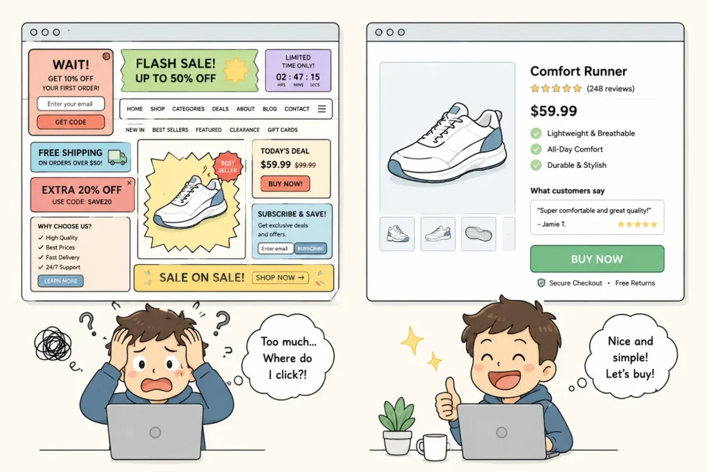
Imagine visiting two websites because you want to buy the same product.
The first one has popups, moving banners, several menus, promotional boxes, five different buttons, and a homepage full of information.
The second one shows you the product, price, benefits, reviews, and a clear button to buy. Which one feels easier?
Google New Ask Button when searching about a brand also work on this feature to make e-commerce simpler by giving direct AI chatbot without going to website.
Most people will choose the second one. Every extra choice asks the visitor to stop and think, and when there are too many options, people can take longer to decide or simply decide not to do anything. This idea is commonly associated with Hick’s Law.
For a business website, the lesson is simple: Don’t make people work harder than necessary to reach the next step.
1. Simplicity Reduces Decision Fatigue
A visitor should not have to make ten decisions before making one important decision.
For example, a service website might show:
- Book a call
- Read our blog
- View our services
- Download our guide
- Follow us
- Join our newsletter
- See our case studies
- Learn about our company
None of these options is necessarily bad.
The problem starts when all of them compete for attention at the same time.
If the main goal of the page is to generate enquiries, the visitor should quickly understand:
What do you offer?
Who is it for?
Why should I trust you?
What should I do next?
That’s enough to get the conversation started.
2. Faster Websites Give People Less Reason to Leave
Speed matters because people are impatient online.
A slow website can increase your bounce rate, which is the percentage of visitors who leave without taking the action you want. If someone has to wait for a page to load before they can even see what you offer, they may simply go back and choose another result.
Simple websites tend to have an advantage here because they can improve website performance by avoiding unnecessary:
- Large image files or duplicate images
- Heavy animations
- Excessive scripts
- Unused plugins
- Complicated page builders
- Features that visitors rarely use
This does not mean every simple website will automatically have a low bounce rate. A fast website still needs useful content and a clear reason for visitors to stay.
But when speed, clarity, and useful content work together, there are fewer reasons for someone to leave.
3. A Clear CTA Makes the Next Step Obvious
One of the easiest ways to improve a website’s conversion rate is to make the main action obvious.
If you want someone to buy, make buying easy. If you want someone to contact you, make contacting you easy. If you want someone to book an appointment, make booking easy.
A clear call to action (CTA) tells visitors what they can do next without making them search for the right button. The path will look different depending on the type of website:
E-commerce website: View product → Understand value → Buy
Service website: Understand service → See proof → Contact
Content website: Find answer → Read → Explore related information
The page can contain other useful elements, but the primary path should remain clear. This is where the idea of one page, one main intent becomes useful. Not every page needs to have only one button. It simply needs one clear purpose.
4. Simple Websites Work Better on Mobile
A large part of online browsing happens on smartphones.
People are often using a website while standing in a queue, sitting on a train, taking a quick break, or trying to complete something in a few minutes.
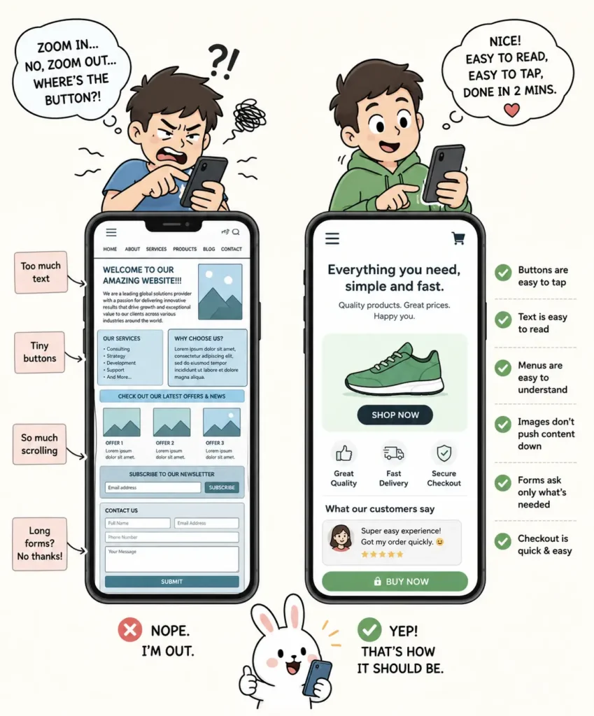
They don’t want to pinch, zoom, swipe around endlessly, or fight with tiny buttons.
A simple layout is easier to adapt to smaller screens, which makes for a better mobile user experience.
Good mobile design means:
- Buttons are easy to tap
- Text is comfortable to read
- Menus are easy to understand
- Images don’t push important content too far down
- Forms don’t ask for unnecessary information
- Checkout does not feel like a chore
This becomes especially important for businesses that depend on mobile visitors for sales or enquiries.
5. Clarity Builds Trust
People make quick judgments about websites.
A cluttered page with confusing navigation, aggressive popups, inconsistent fonts, and too many promotional messages can make a business feel less trustworthy.
A clean website creates a different impression. It tells the visitor:
Here’s what we do.
Here’s what you need to know.
Here’s how you can get started.
That clarity can make a business feel more confident and professional.
There is also something important about familiarity.
People are already used to certain website patterns. They expect the logo to be easy to find, navigation to be predictable, buttons to look clickable, and important information to be easy to access.
You don’t need to reinvent these patterns to create a memorable website.
Sometimes familiar is better than clever.
6. Respecting People’s Time Is Good UX
This is one of the most overlooked parts of website design. People notice when a website respects their time.
If they can find an answer in 20 seconds instead of two minutes, that feels good. If they can complete a purchase without creating an account, that feels good. If they can contact a business without filling out a form with 12 fields, that feels good.
Small improvements like these reduce friction. And when there is less friction, people are more likely to continue.
Think about the difference
| Friction-heavy website | Simple website |
| Too many competing options | Clear next step |
| Slow pages | Quick access to information |
| Long forms | Only necessary fields |
| Distracting popups | Helpful content |
| Complicated navigation | Familiar structure |
| Too many CTAs | One clear primary action |
The difference is not just visual.
It changes how easy the website feels to use.
7. Simple Content Can Be Better for SEO Too
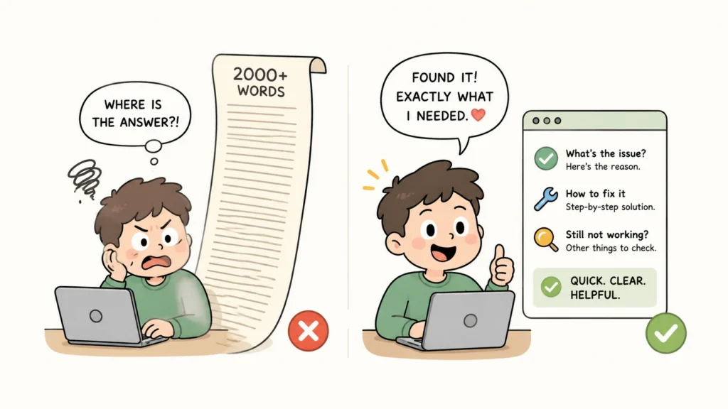
There is a common misunderstanding that a page needs to be extremely long to perform well in search.
It doesn’t. A useful page should be as long as it needs to be to answer the user’s question properly.
If someone searches for a simple question, giving them the answer quickly is helpful.
This also helps reduce the chance of pogo-sticking, where a visitor clicks a search result, fails to find what they need, and quickly returns to the search results to try another page.
Pogo-sticking can happen for many reasons, so it should not be treated as a simple measure of whether a page is good or bad. The practical lesson is more useful: match the page to what the visitor came looking for and make the answer easy to find.
Adding another 1,500 words just to make the article longer does not automatically make it better.
Good content should answer the real question behind the search.
For example, someone searching for a specific website problem probably wants:
- The reason it happens
- How to fix it
- What to check if the first solution doesn’t work
They probably don’t need a long introduction about the history of websites. This is where information density matters more than word count.
Useful information beats unnecessary length.
8. Different Visitors Need Different Paths
Not everyone comes to a website for the same reason. A useful way to think about website pages is through three common types of intent.
Reader Intent
The visitor wants information.
The page should focus on:
- Easy reading
- Clear headings
- Helpful explanations
- Useful examples
- Related information
Avoid covering the article with sales messages.
Let the content do its job first.
Buyer Intent
The visitor is considering a purchase.
They need:
- Clear product information
- Price
- Benefits
- Reviews or proof
- Delivery or return information
- An obvious purchase button
Don’t force them through unnecessary steps.
Service Intent
The visitor wants help from a business.
They usually need:
- What the business does
- Who it helps
- Evidence that the business is reliable
- How to contact them
- A simple way to take the next step
A short contact form can often be more useful than a long questionnaire.
Keep the Website Structure Simple
This is also where website information architecture matters.
Visitors should be able to understand how your website is organised without having to think about it.
Main pages should have a logical relationship, navigation should use familiar labels, and important information should not be buried several clicks deep.
Good structure makes a website easier for both people and search engines to understand.
9. Fancy Features Are Not Always Useful
There is nothing wrong with animations, videos, interactive elements, or creative layouts. The problem is using them simply because they look impressive, even when they don’t improve the user experience.
Ask one question before adding a feature: Does this help the visitor?
If an animation explains a product, it may be useful. If an interactive calculator helps someone make a decision, it may be useful. If a video answers a common question, it may be useful.
But if an effect only makes the homepage heavier and slower, it may not be worth the cost. Good design is not about adding more. It is about choosing what deserves to stay.
10. Simple Websites Can Create Better Customer Experiences
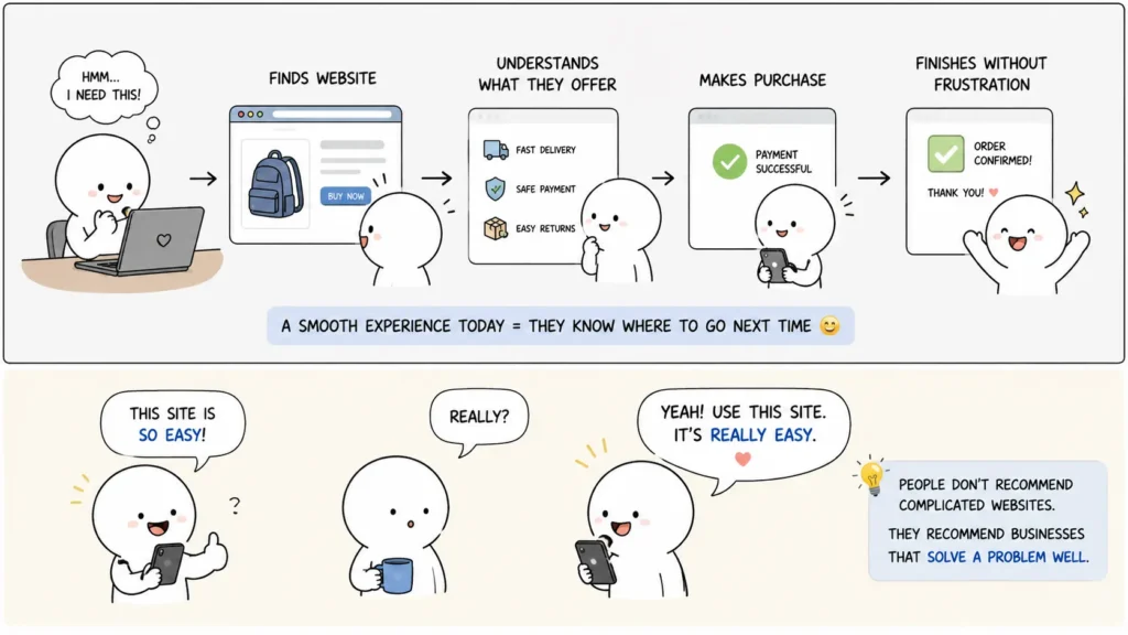
A good first visit can influence what happens later. Suppose a customer finds your website, understands what you offer, makes a purchase, and finishes the process without frustration. The next time they need the same thing, they already know where to go. They don’t have to start the search again. That’s valuable.
A good experience can also make recommendations easier. People are much more likely to tell someone, “Use this site. It’s really easy.”
They rarely recommend a website because it has the most complicated design. They recommend & preferred businesses that solve a problem well.
Common Website Mistakes That Hurt Performance
Common mistakes include:
- Adding features because they look impressive rather than being useful
- Using too many popups, banners, and promotional messages
- Making visitors click through several pages to find basic information
- Ignoring mobile usability
- Writing long content when a shorter answer would be more helpful
- Giving every page too many goals instead of one clear purpose
Simple Doesn’t Mean Cheap
This distinction matters. A simple website can be carefully designed, technically strong, visually polished, and highly effective. In fact, removing unnecessary elements can require more thought than adding them.
Anyone can add another section. The harder question is:
Does this section need to be here?
The same applies to navigation, buttons, forms, images, animations, popups, and even written content. Every element should earn its place.
A Better Way to Think About Website Design
Instead of starting with: What can we add to the website?
Start with: What does the visitor need?
Then build around that.
A useful priority order looks like this:
- Make it accessible
The website should load, work properly, and function across devices. - Make it understandable
Visitors should immediately know what the business offers. - Make it trustworthy
Show useful proof, accurate information, reviews, credentials, or other relevant signals. - Make the next step obvious
Give visitors a clear action. - Make it attractive
Once the foundation works, use design to strengthen the experience.
This order prevents design from becoming the main goal.
The Real Advantage of Simplicity
A simple website does not try to impress visitors at every moment. It helps them. That’s the real difference. When someone can open a page, understand the message, find what they need, trust the business, and take action without unnecessary effort, the website is doing its job.
That can have a direct effect on business results. Less confusion can mean more engagement, less friction can mean more enquiries, an easier checkout can mean more purchases, and better performance can mean a better experience. When people have a good experience, they are also more likely to come back.
So the goal should not be to build the most impressive website in the room. Build the website that makes the visitor think:
“That was easy.”
That feeling is simple, but for a business, it can be worth a lot.
 Add Content Decoded as a preferred source